The Grid
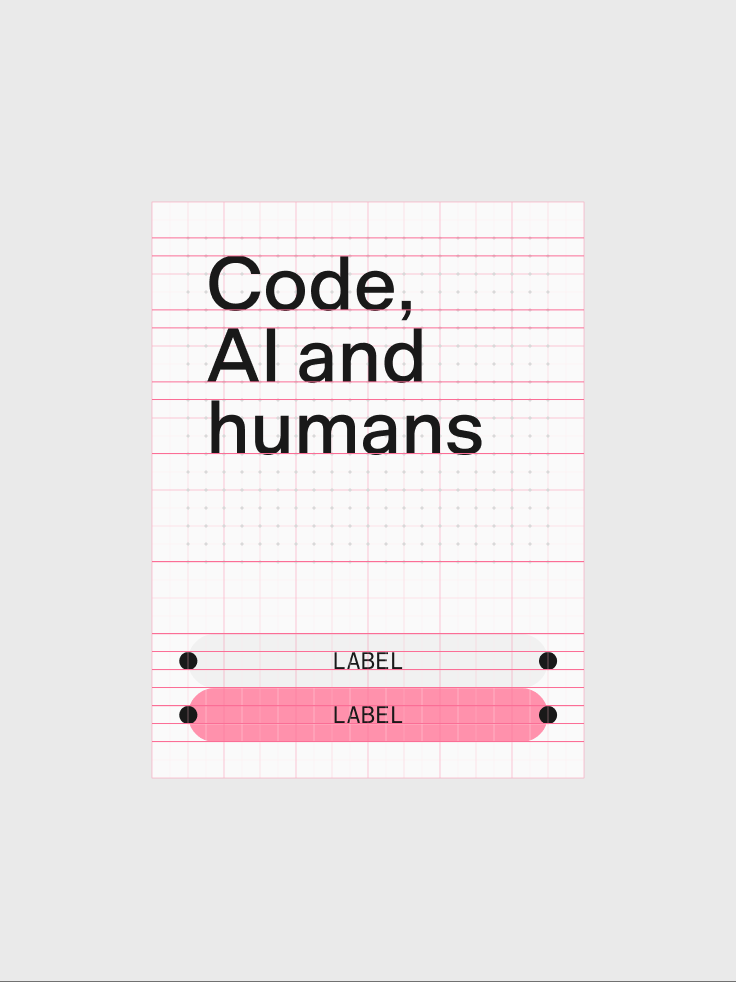
The grid is not decorative. It directly expresses how the n8n product works: modular, composable, and built to scale. Every layout decision across the brand is guided by it. It keeps our visual language coherent across contexts without making it rigid.
Base unit
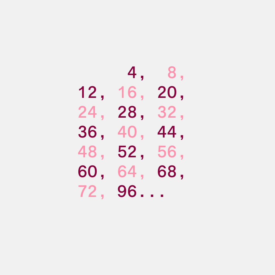
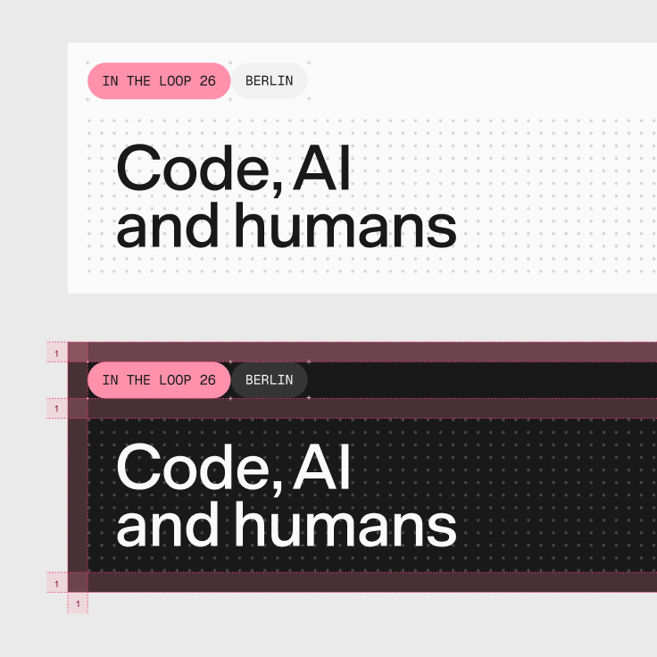
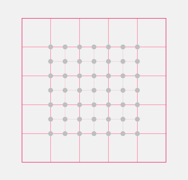
Every unit is a multiple of a base unit. We size spacing tokens and grids in multiples of 8, or 4 where finer control is needed, so everything stays aligned.
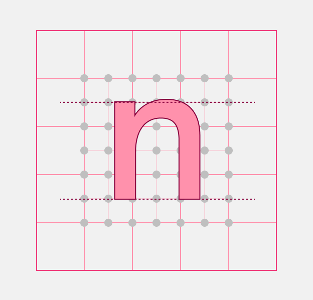
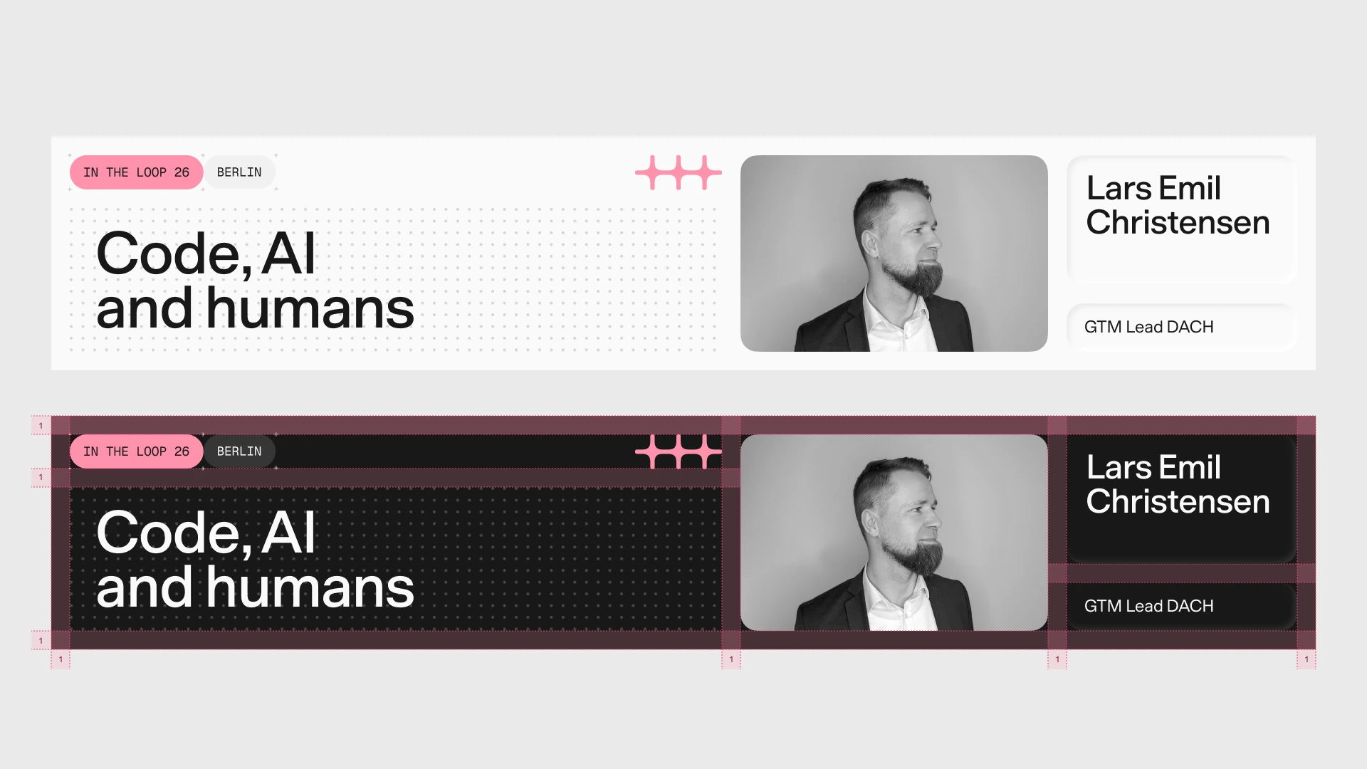
When building a layout, choose a base unit (for example, 16px). It then governs every placed element, from the dot grid to capsules and typography.
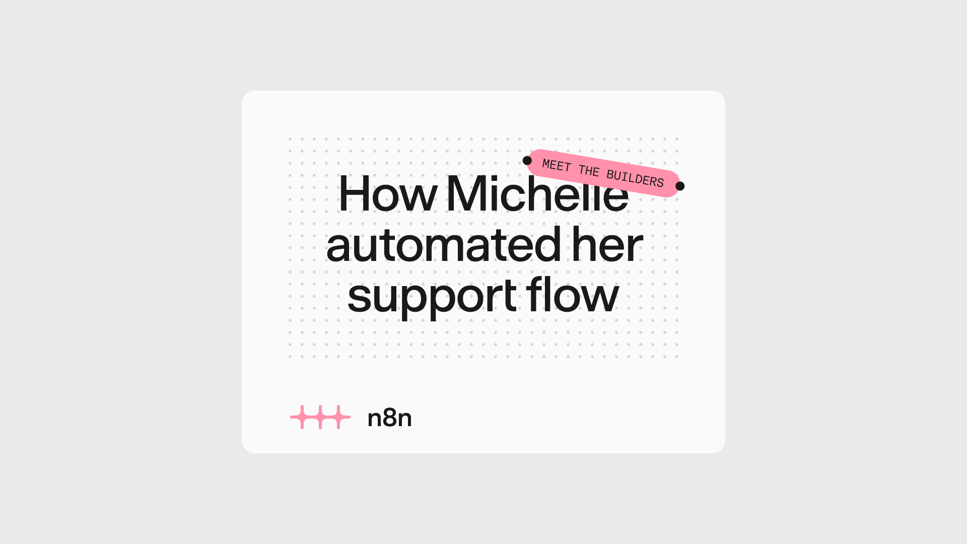
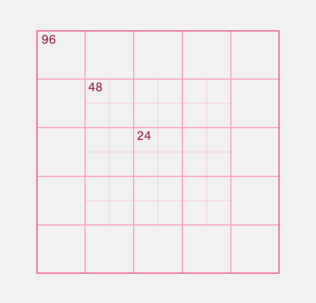
The unit grid is the foundation for most brand applications. Rather than a fixed column system, it uses a modular grid of equal units that can tile, divide, and recombine across any format.


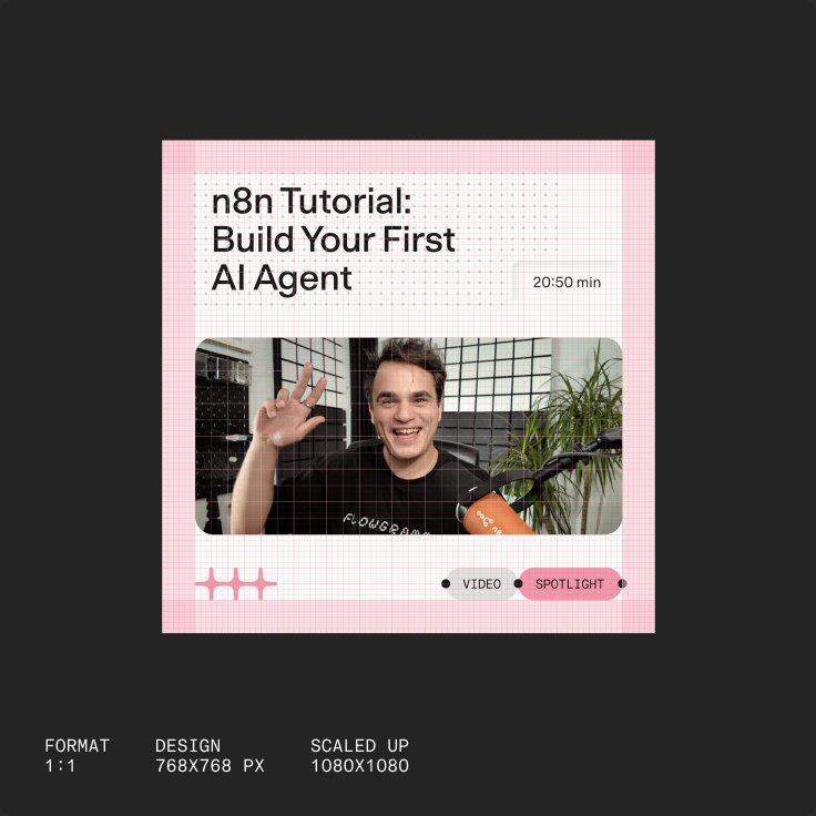
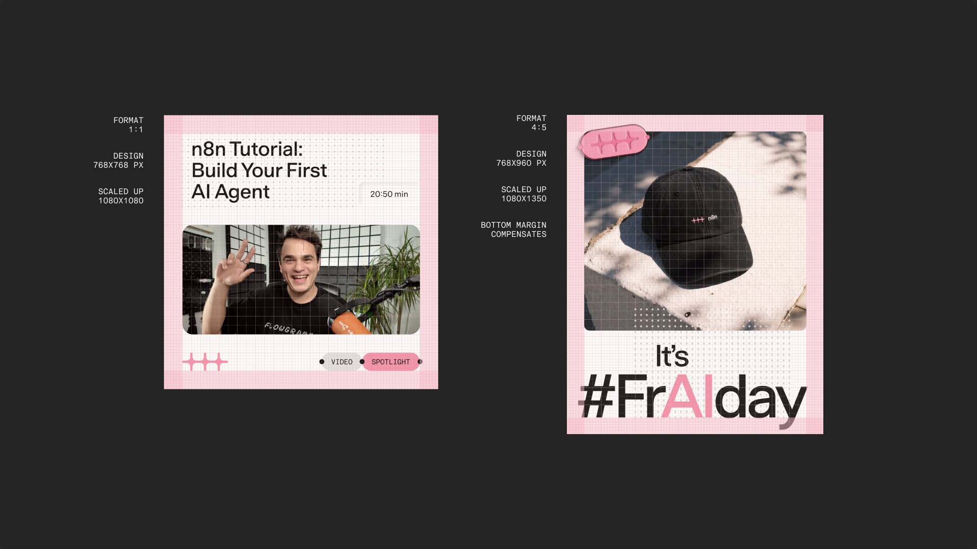
Fixed formats can make the 4px increment impractical. The 4:5 Instagram portrait (1080×1350 px) is one example, since 1350 doesn’t divide evenly by 4. In these cases, add a margin to make the composition fit the format, or design at a larger size that is divisible by 4 and scale down. The grid guides the layout even where it can’t dictate it precisely.
Breaking the rules
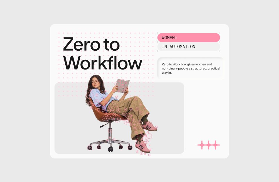
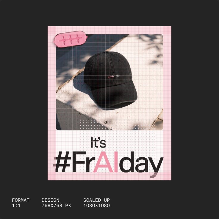
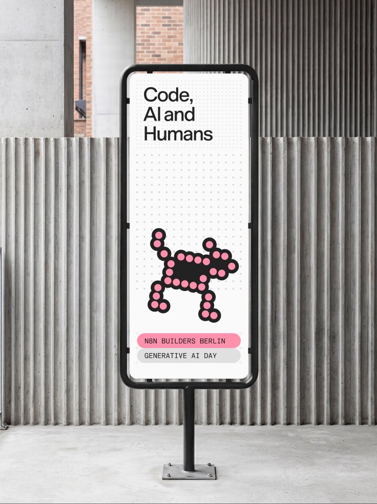
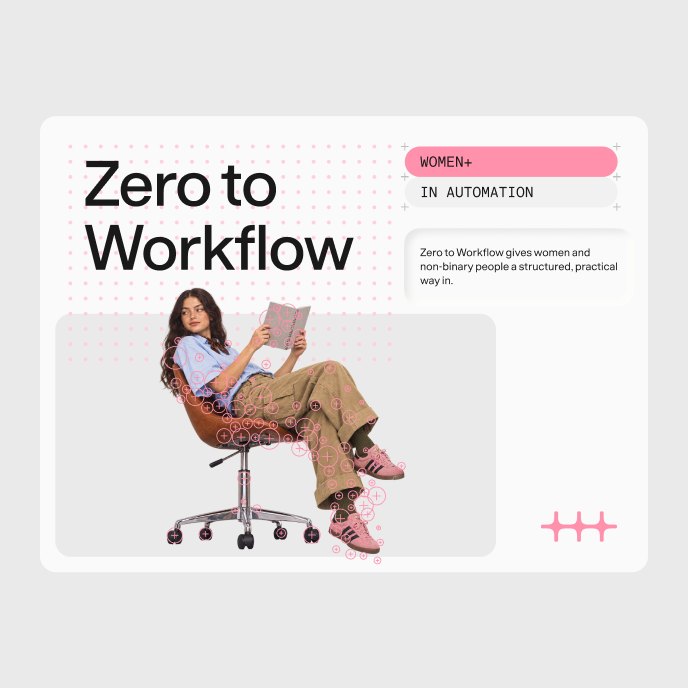
The grid gives our layouts structure, but we occasionally let photography and illustration break from it to add playfulness and creativity.
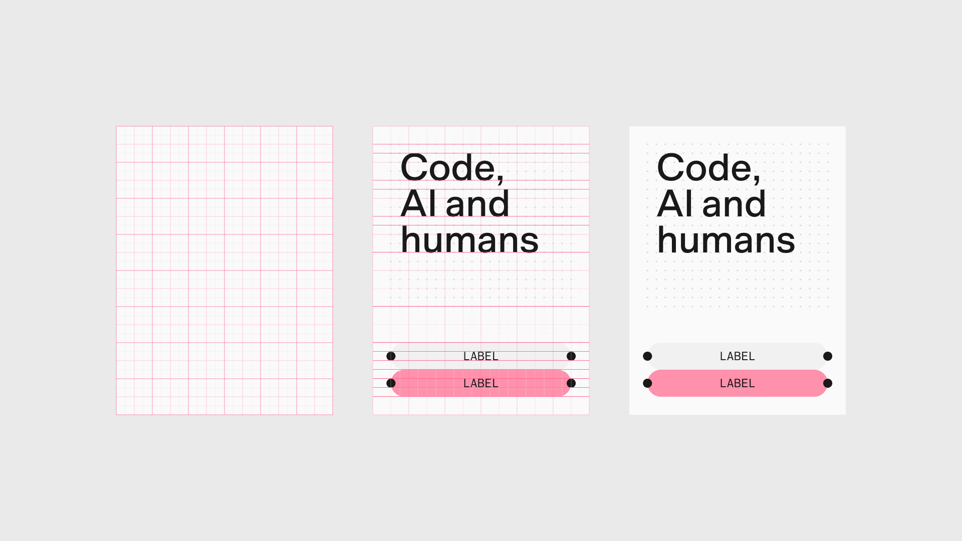
The grid is not decorative. It directly expresses how the n8n product works: modular, composable, and built to scale. Every layout decision across the brand is guided by it. It keeps our visual language coherent across contexts without making it rigid.
Base unit
Every unit is a multiple of a base unit. We size spacing tokens and grids in multiples of 8, or 4 where finer control is needed, so everything stays aligned.
When building a layout, choose a base unit (for example, 16px). It then governs every placed element, from the dot grid to capsules and typography.
The unit grid is the foundation for most brand applications. Rather than a fixed column system, it uses a modular grid of equal units that can tile, divide, and recombine across any format.
Fixed formats can make the 4px increment impractical. The 4:5 Instagram portrait (1080×1350 px) is one example, since 1350 doesn’t divide evenly by 4. In these cases, add a margin to make the composition fit the format, or design at a larger size that is divisible by 4 and scale down. The grid guides the layout even where it can’t dictate it precisely.
Breaking the rules
The grid gives our layouts structure, but we occasionally let photography and illustration break from it to add playfulness and creativity.