Colors
Our color system rests on one principle: a single signature color, used consistently, builds more recognition than a mix of colors. A simple palette of neutrals supports it, working for both technical precision and playful moments.
Core palette
Our primary palette is a range of solid neutrals, a strong foundation for every n8n touchpoint. Pink, our signature color, completes it with real impact.
Click any color to copy the hex code.
The pink
Pink has always been part of n8n’s identity. As a visual anchor, it brings consistency, warmth, and immediate recognition to every touchpoint. Used with intention, it becomes a precise marker of who we are.
Click the color to copy the hex code.
Highlight
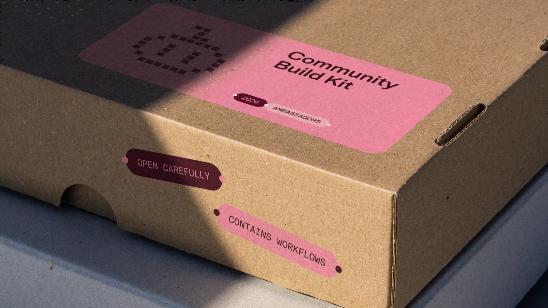
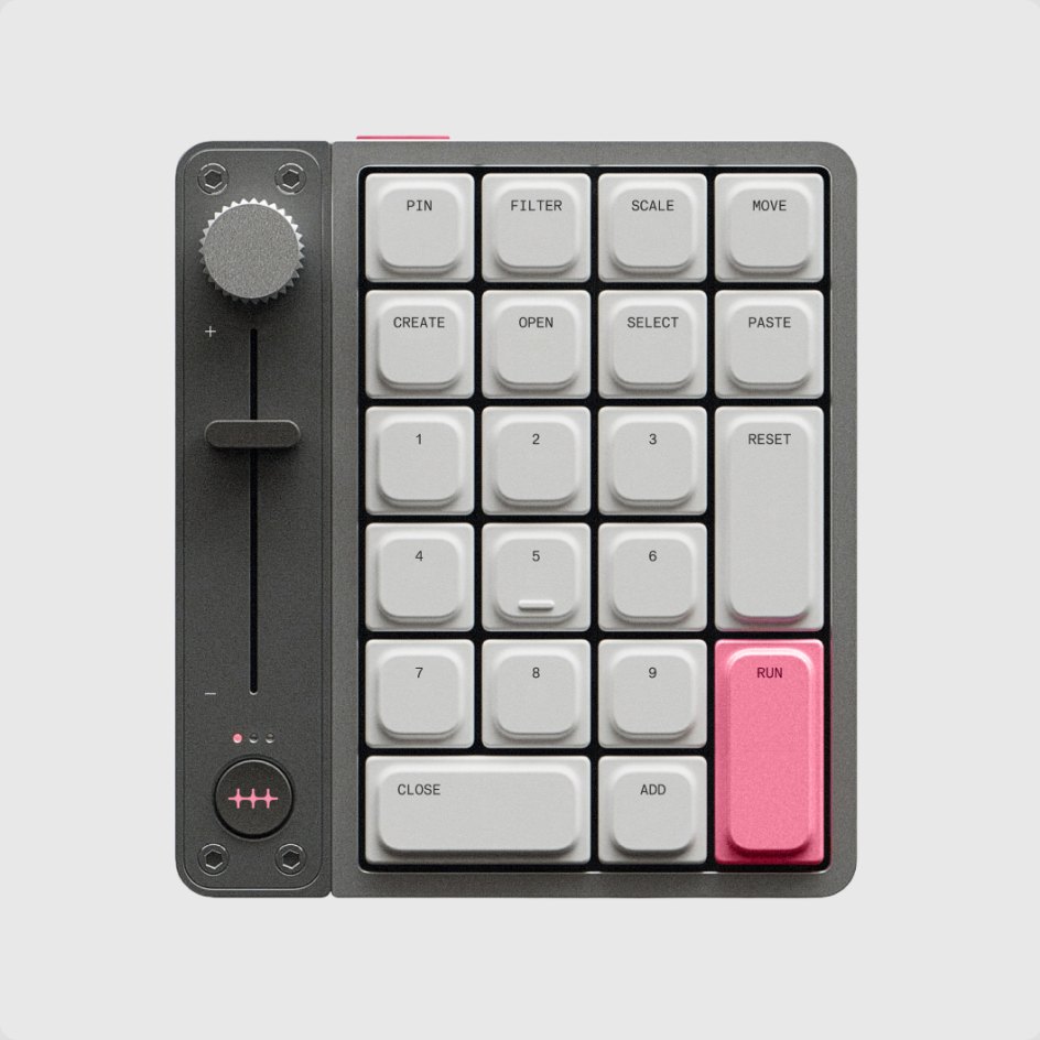
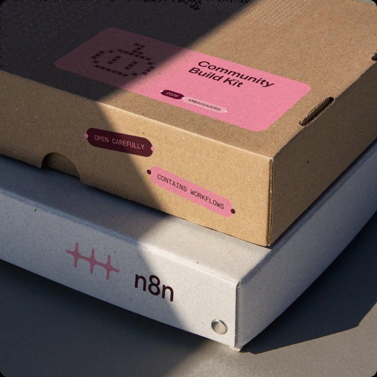
At its most direct, Accent Pink marks our identity. Applied to the logo, graphic devices, or physical objects, it makes n8n unmistakable.
Functional
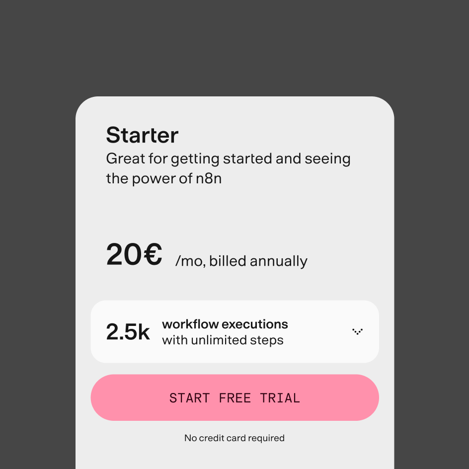
In product UI, the palette communicates state, hierarchy, and navigation, helping users understand where they are, where they can go, and what they can do.
Transitional
In motion, color marks the threshold between states. The pink scale makes transitions visible, so the brand surfaces briefly from one moment to the next, as a wash, a flash, or a gradient.
Background + ambiance
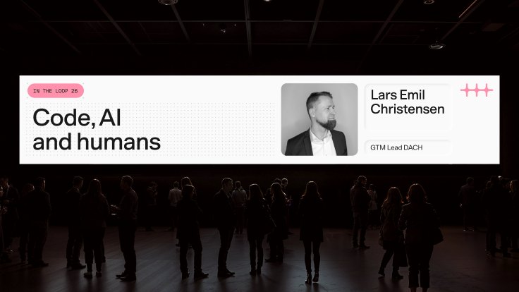
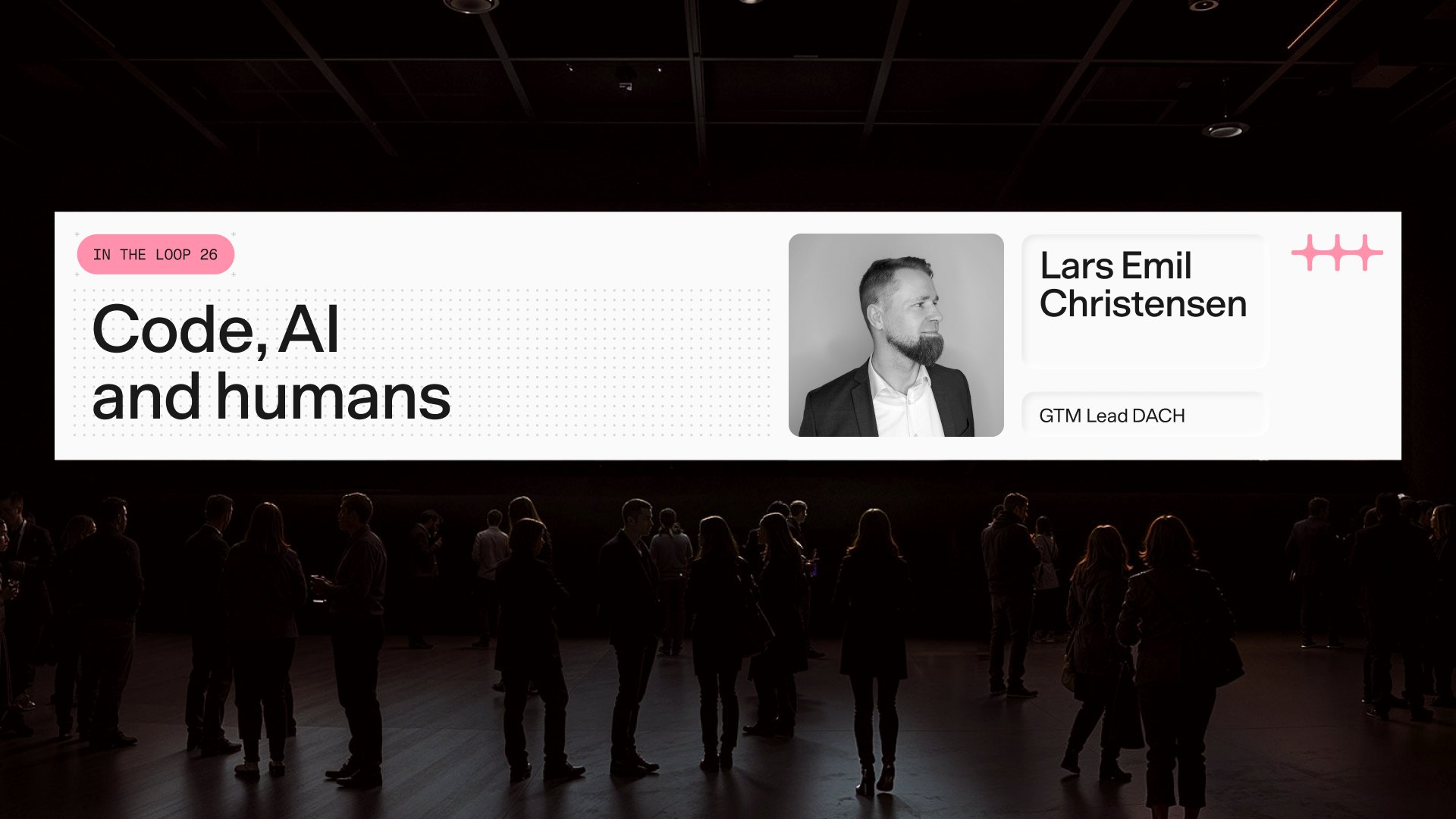
At its most expansive, color stops being applied and starts being inhabited. In physical spaces such as events, lighting design, and large installations, the pink scale becomes atmosphere. The brand isn’t on a surface; it fills the room.

Graphic modes
n8n speaks to many audiences, from individual builders deep in a workflow to enterprise stakeholders evaluating a platform. Our color modes let us adjust to each. They are not different brands but different registers of the same one: expressive when the moment calls for personality, restrained when clarity and function come first.
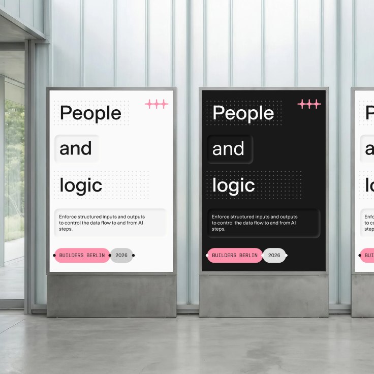
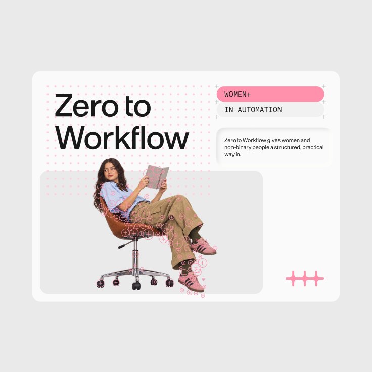
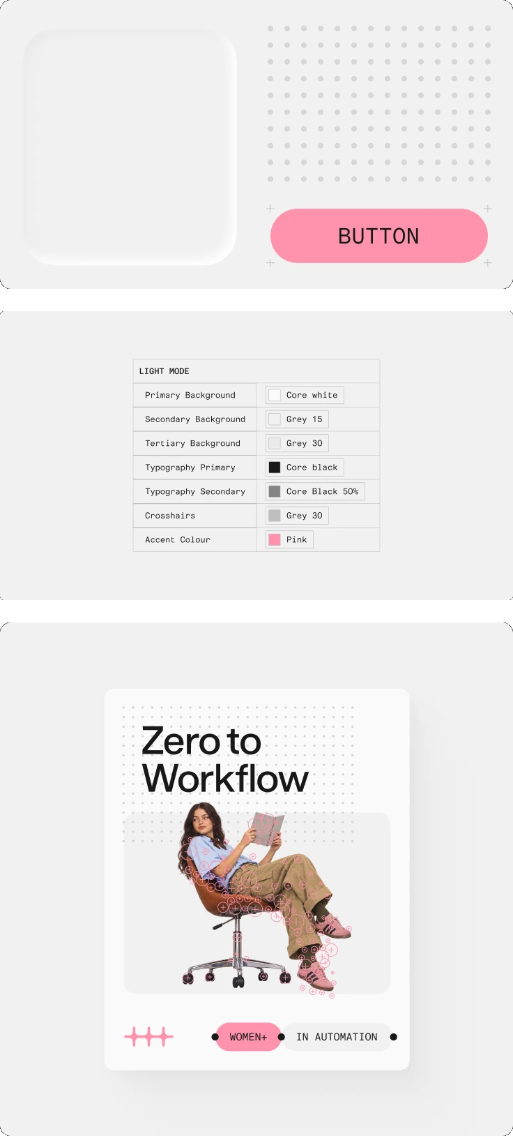
Light mode
Light mode is our default and most versatile register, and the most approachable face of the brand. It focuses on organizational impact, simplifies complexity, and keeps attention on the bigger picture.
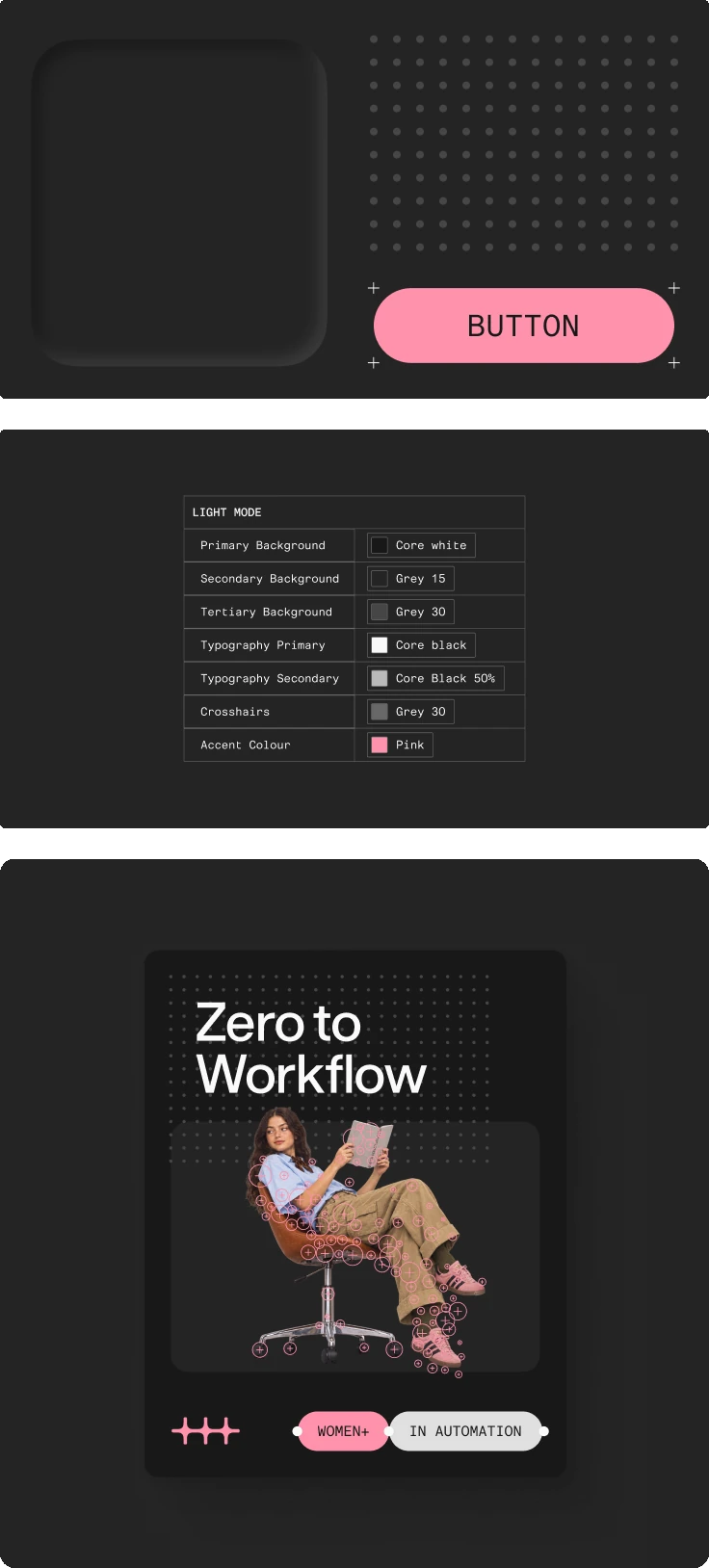
Dark mode
Dark mode is the most technical register: immersive, precise, and uncompromising. It suits audiences who are deep in the work and care about the details. We often use it for enterprise content and events, where we need to convey authority and proficiency.
Secondary tones
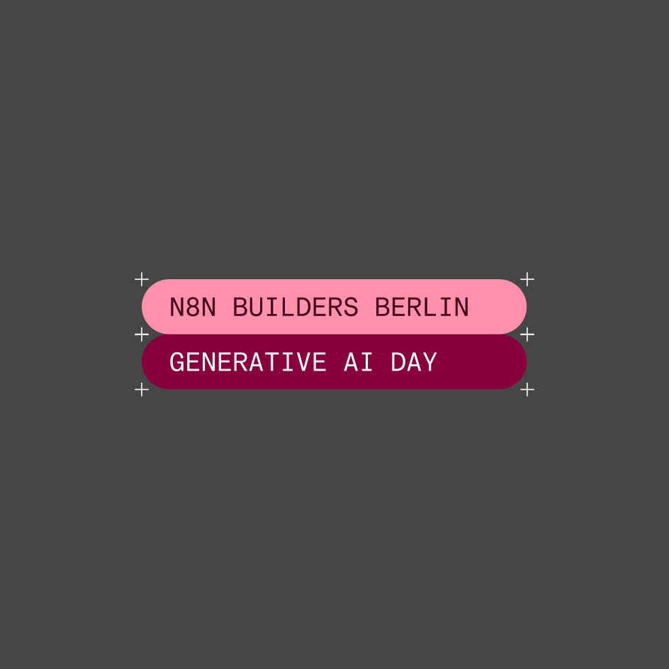
Our secondary tones are drawn from the range of our pink. We use them for moments that demand attention and need to stand apart from the main branding: launches, events, campaigns, and key visuals, where n8n needs to be highly visible.
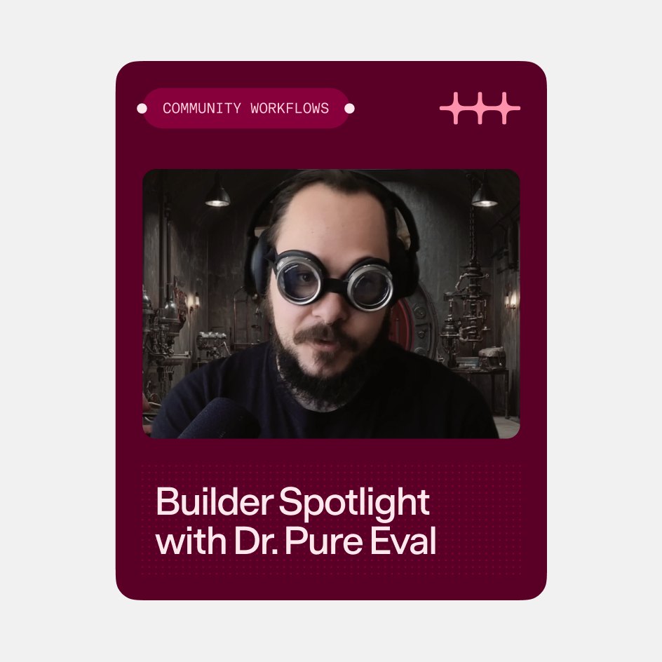
We also use them in community-led content to add fun and set assets apart from the primary brand colors.
Click any color to copy the hex code.
Our color system rests on one principle: a single signature color, used consistently, builds more recognition than a mix of colors. A simple palette of neutrals supports it, working for both technical precision and playful moments.
Core palette
Our primary palette is a range of solid neutrals, a strong foundation for every n8n touchpoint. Pink, our signature color, completes it with real impact.
Click any color to copy the hex code.
The pink
Pink has always been part of n8n’s identity. As a visual anchor, it brings consistency, warmth, and immediate recognition to every touchpoint. Used with intention, it becomes a precise marker of who we are.
Click the color to copy the hex code.
Highlight
At its most direct, Accent Pink marks our identity. Applied to the logo, graphic devices, or physical objects, it makes n8n unmistakable.
Functional
In product UI, the palette communicates state, hierarchy, and navigation, helping users understand where they are, where they can go, and what they can do.
Transitional
In motion, color marks the threshold between states. The pink scale makes transitions visible, so the brand surfaces briefly from one moment to the next, as a wash, a flash, or a gradient.
Background + ambiance
At its most expansive, color stops being applied and starts being inhabited. In physical spaces such as events, lighting design, and large installations, the pink scale becomes atmosphere. The brand isn’t on a surface; it fills the room.
Graphic modes
n8n speaks to many audiences, from individual builders deep in a workflow to enterprise stakeholders evaluating a platform. Our color modes let us adjust to each. They are not different brands but different registers of the same one: expressive when the moment calls for personality, restrained when clarity and function come first.
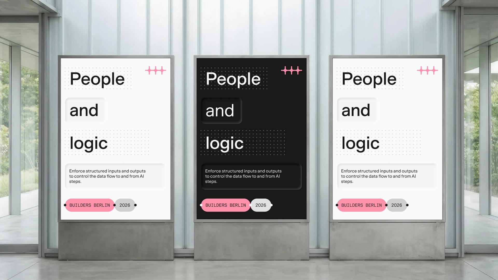
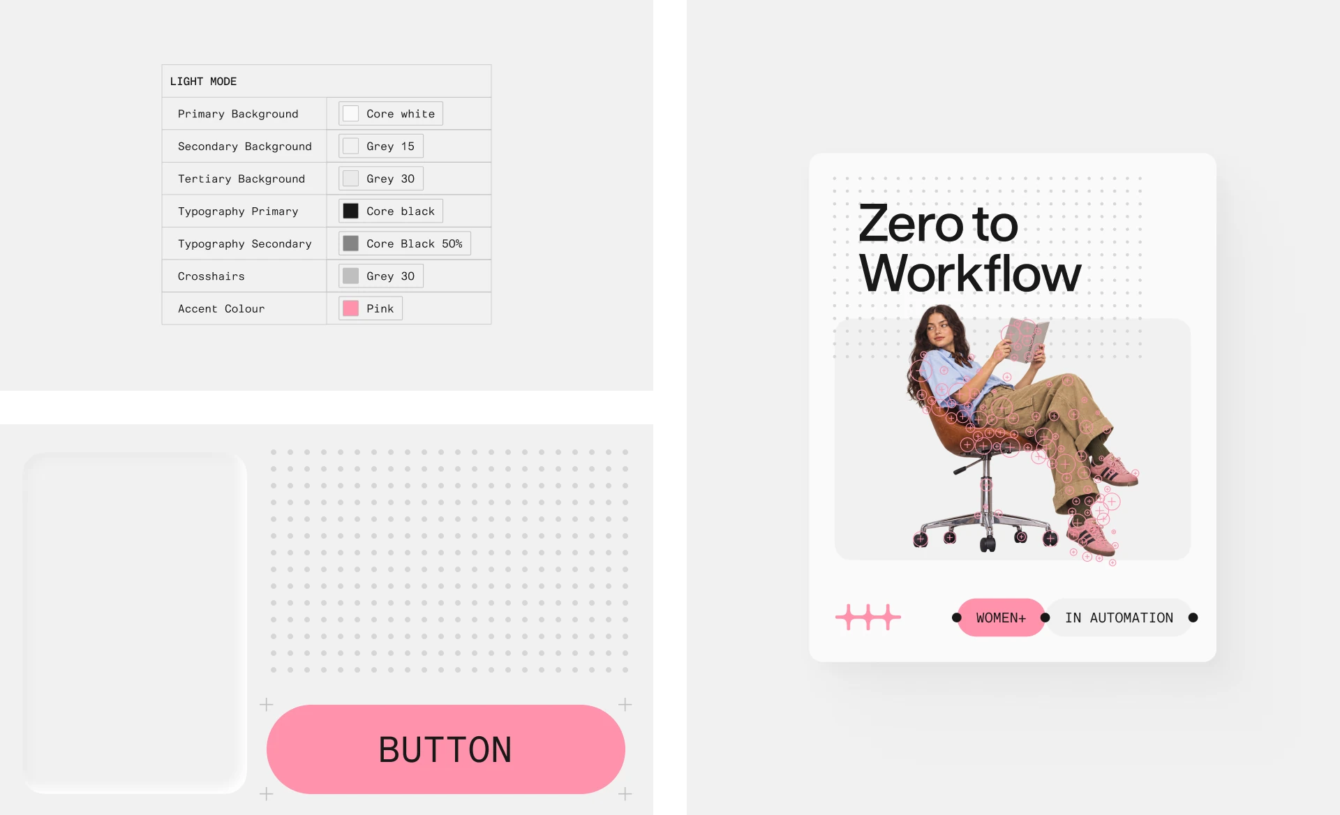
Light mode
Light mode is our default and most versatile register, and the most approachable face of the brand. It focuses on organizational impact, simplifies complexity, and keeps attention on the bigger picture.
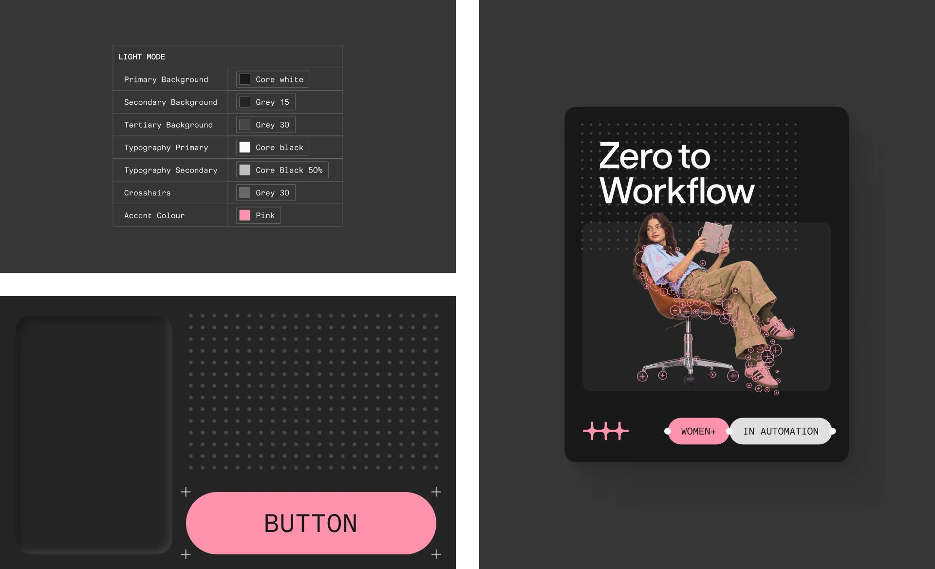
Dark mode
Dark mode is the most technical register: immersive, precise, and uncompromising. It suits audiences who are deep in the work and care about the details. We often use it for enterprise content and events, where we need to convey authority and proficiency.
Secondary tones
Our secondary tones are drawn from the range of our pink. We use them for moments that demand attention and need to stand apart from the main branding: launches, events, campaigns, and key visuals, where n8n needs to be highly visible.
We also use them in community-led content to add fun and set assets apart from the primary brand colors.
Click any color to copy the hex code.